Responsive Test Tool - Free SEO Tools
 ResponsiveTestTool.com is a free online utility that lets you preview how a website appears on different screen sizes and devices. It simulates desktops, laptops, tablets, and smartphones, allowing you to test responsive layouts without switching between physical devices.
The tool is useful for checking whether your pages display correctly across a wide range of screen resolutions.
ResponsiveTestTool helps you review important elements of a responsive website, including:
These checks can help you identify layout issues before they affect visitors or search engine rankings.
A responsive website provides a better user experience and supports modern SEO best practices. Mobile-friendly pages are easier to navigate, reduce bounce rates, and perform better across different devices.
Regular testing also helps you catch layout shifts, overlapping elements, and content overflow after website updates or redesigns.
If you want to check how your website appears at different screen sizes, try our resolution checker.
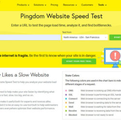
Page speed is just as important as responsive design, so you can also test your website with our website speed test to identify loading issues and improve overall performance.
ResponsiveTestTool is a simple and practical solution for testing website layouts on multiple devices. It’s well suited for developers, designers, and webmasters who want to verify responsive behavior quickly without installing additional software.