Resolution Checker - Free SEO Tools
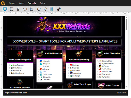
 Screenfly Resolution Checker is a free tool that lets you preview how your website appears on different screen sizes. It simulates desktops, laptops, tablets, televisions, and smartphones, helping you verify that your pages display correctly across a wide range of devices.
Instead of testing on multiple physical devices, you can quickly review your site’s layout from a single browser.
Screenfly makes it easy to test several important aspects of responsive web design, including:
As a result, you can identify layout problems before they affect visitors or search engine performance.
Responsive websites provide a better experience for users on every device. In addition, search engines favor mobile-friendly pages because they are easier to browse and navigate.
Regular testing helps you catch layout shifts, overlapping elements, and display issues after design updates or theme changes.
If you want another option for checking responsive layouts, try our responsive test tool.
You can also explore online SEO tools by Toolsaday.com, which include additional utilities for technical SEO, page analysis, and website optimization.
Screenfly Resolution Checker is a simple and effective way to test responsive layouts across different devices. It’s a useful resource for developers, designers, and webmasters who want to ensure their websites look great on every screen size.